Design process images and updates for convergent, an italic font designed by Harmonious Type Co.
a record of the design process for convergent, a fanciful italic font based on calligraphic forms
Part 1. Planning
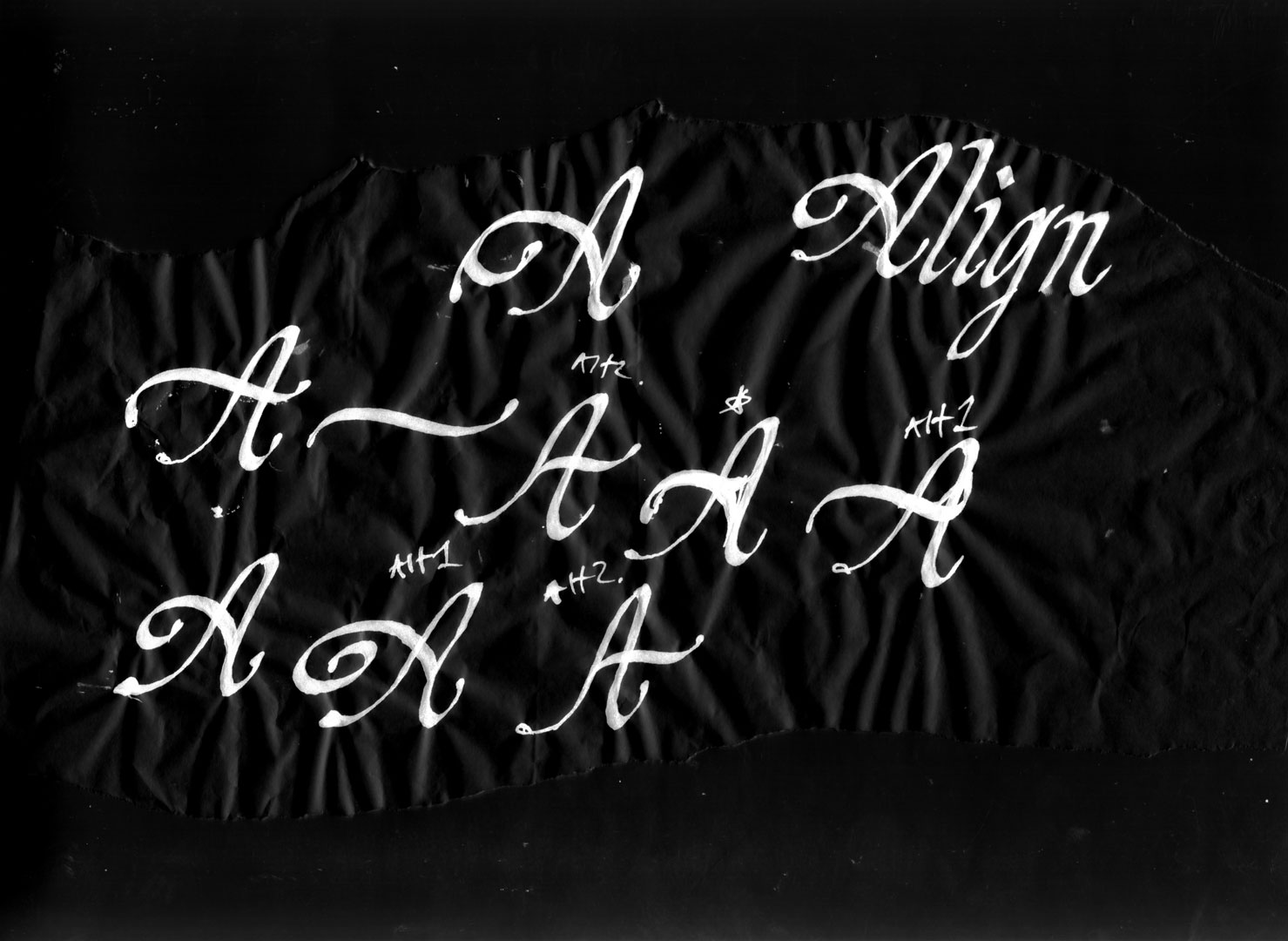
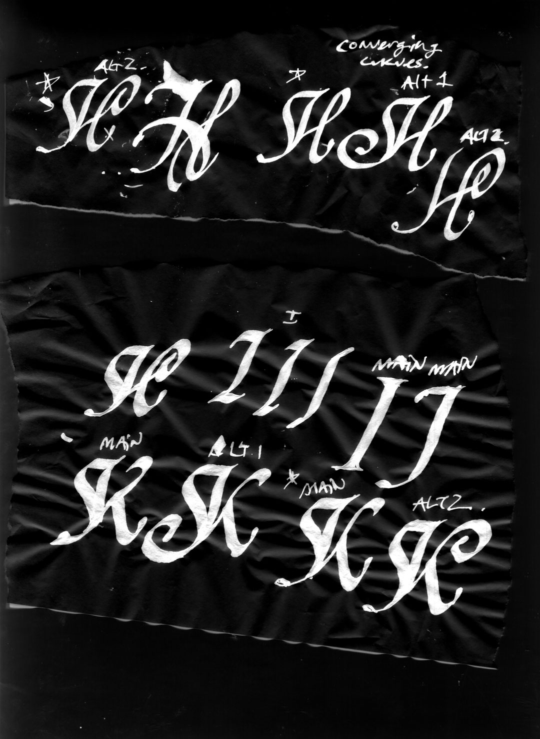
With the goal of designing a fanciful italic font for the Harmonious Type Co. website, this font began as rough calligraphy on paper. Revisions to the written forms were explored through pencil illustrations.
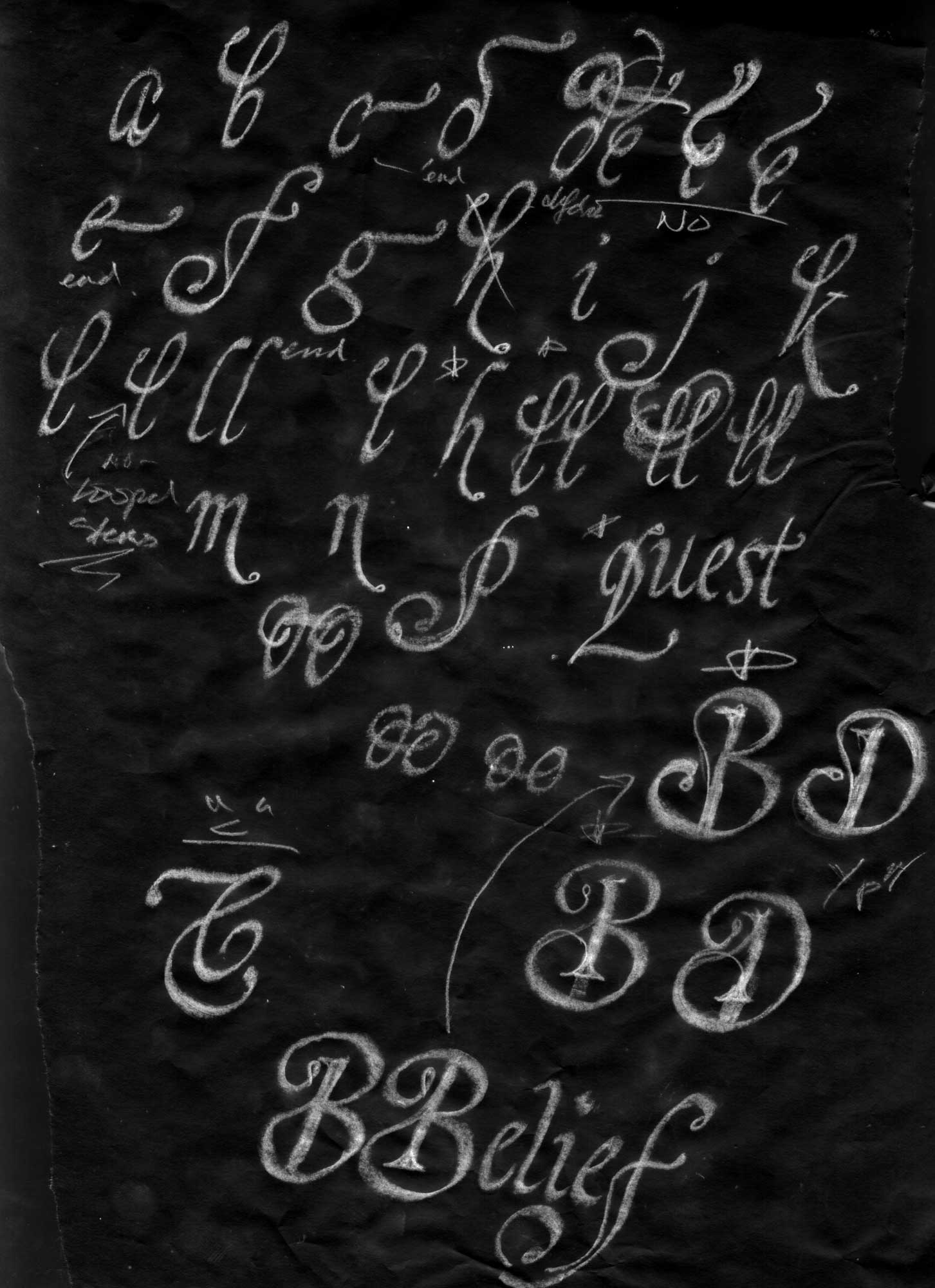
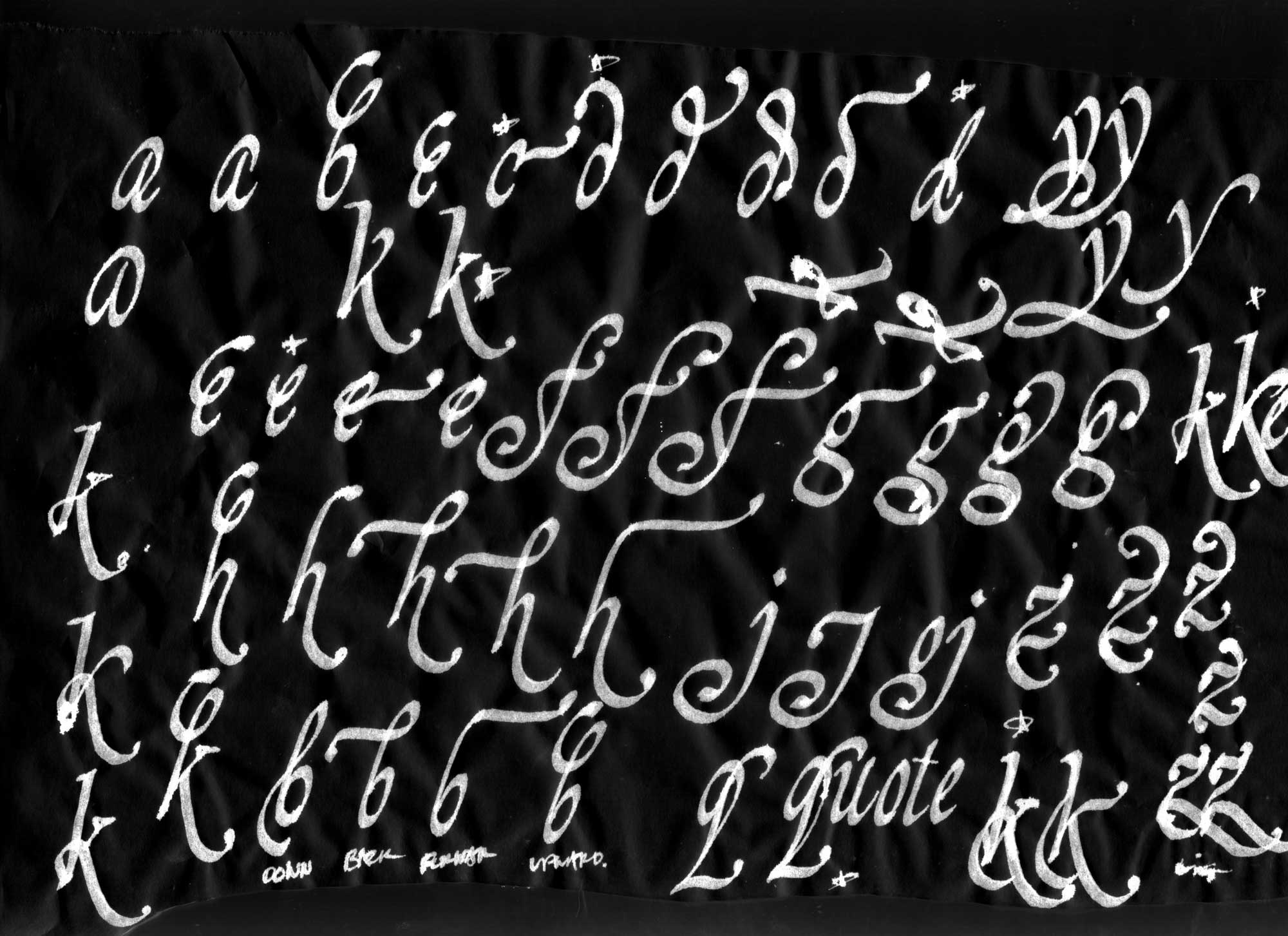
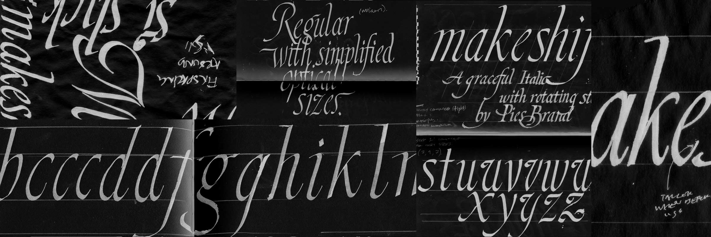
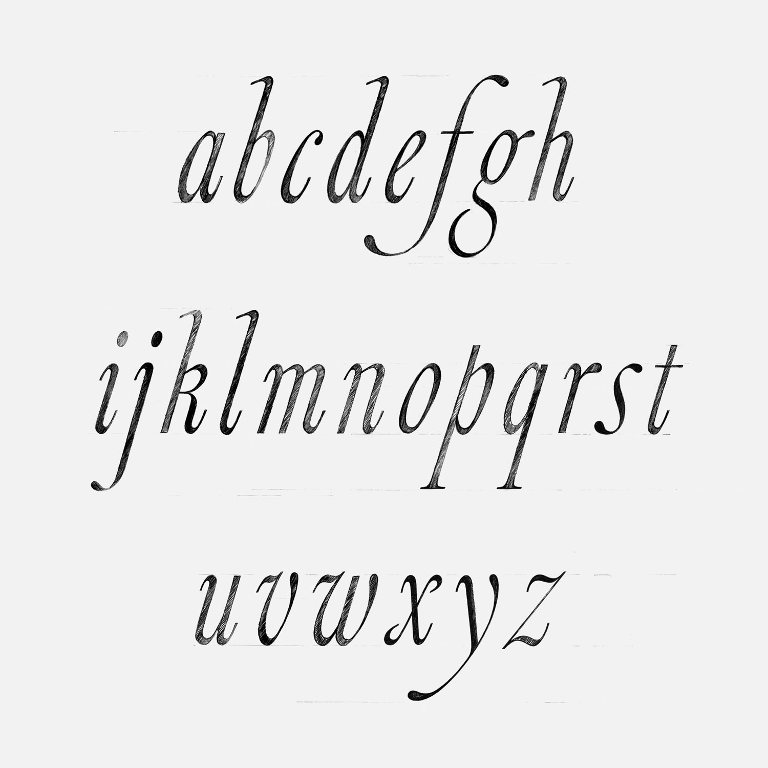
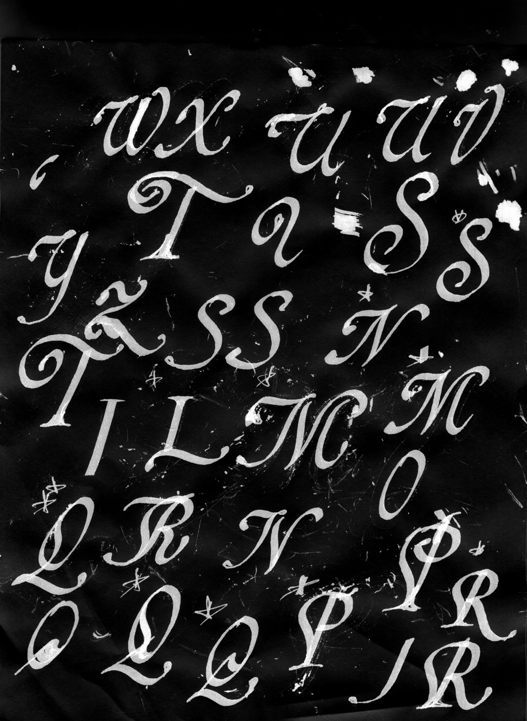
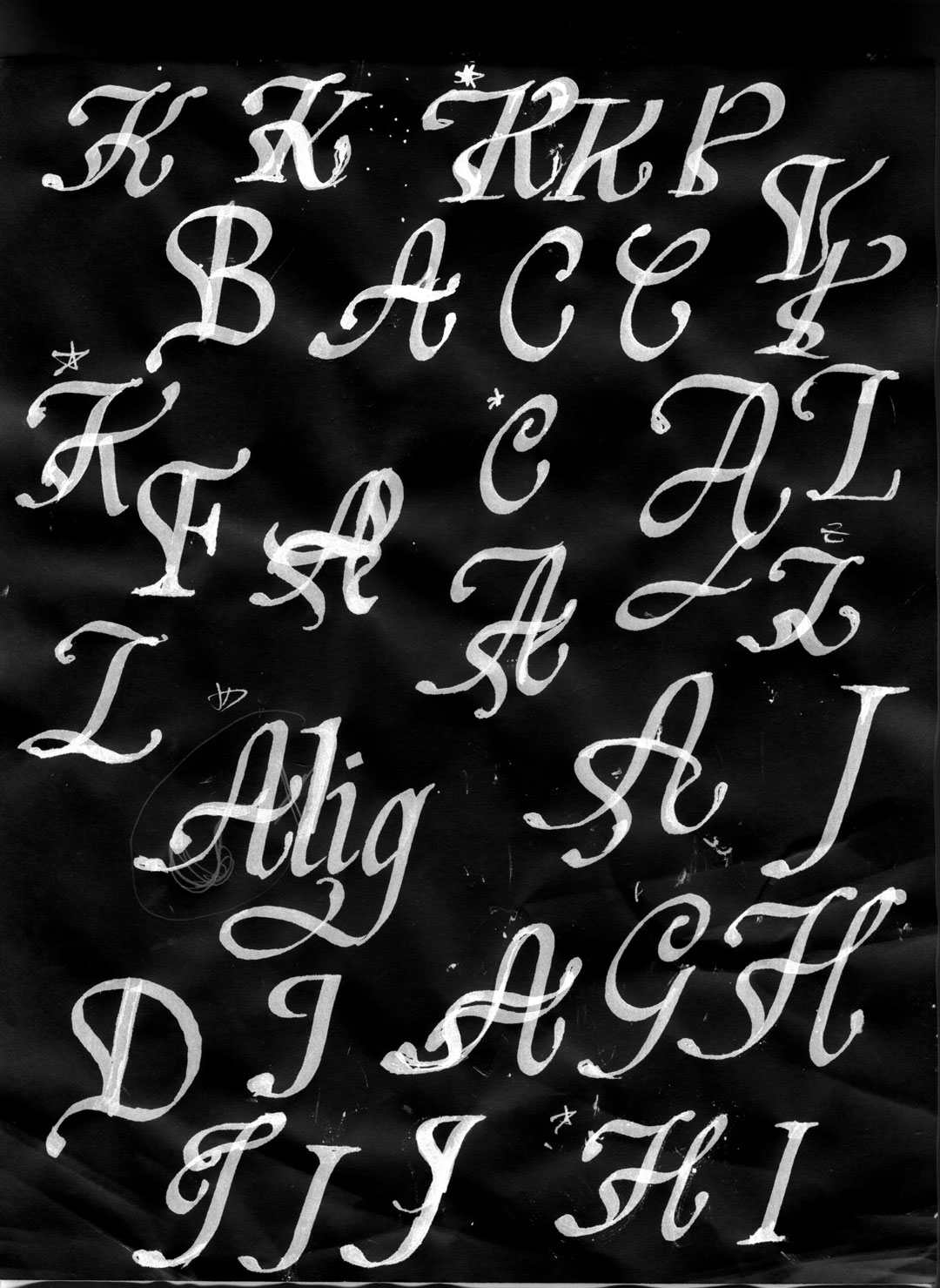
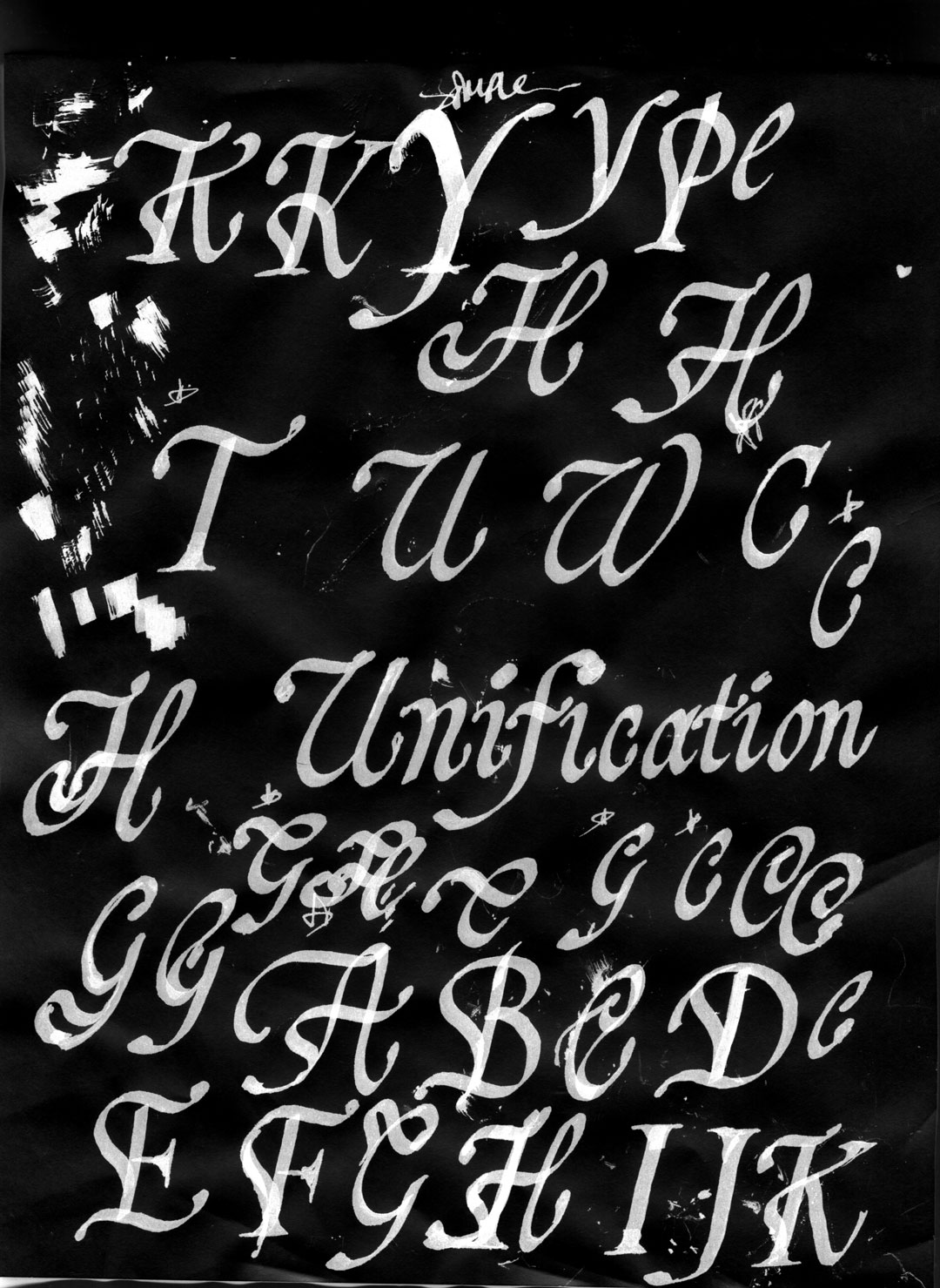
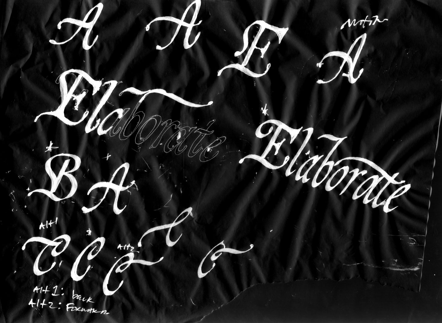
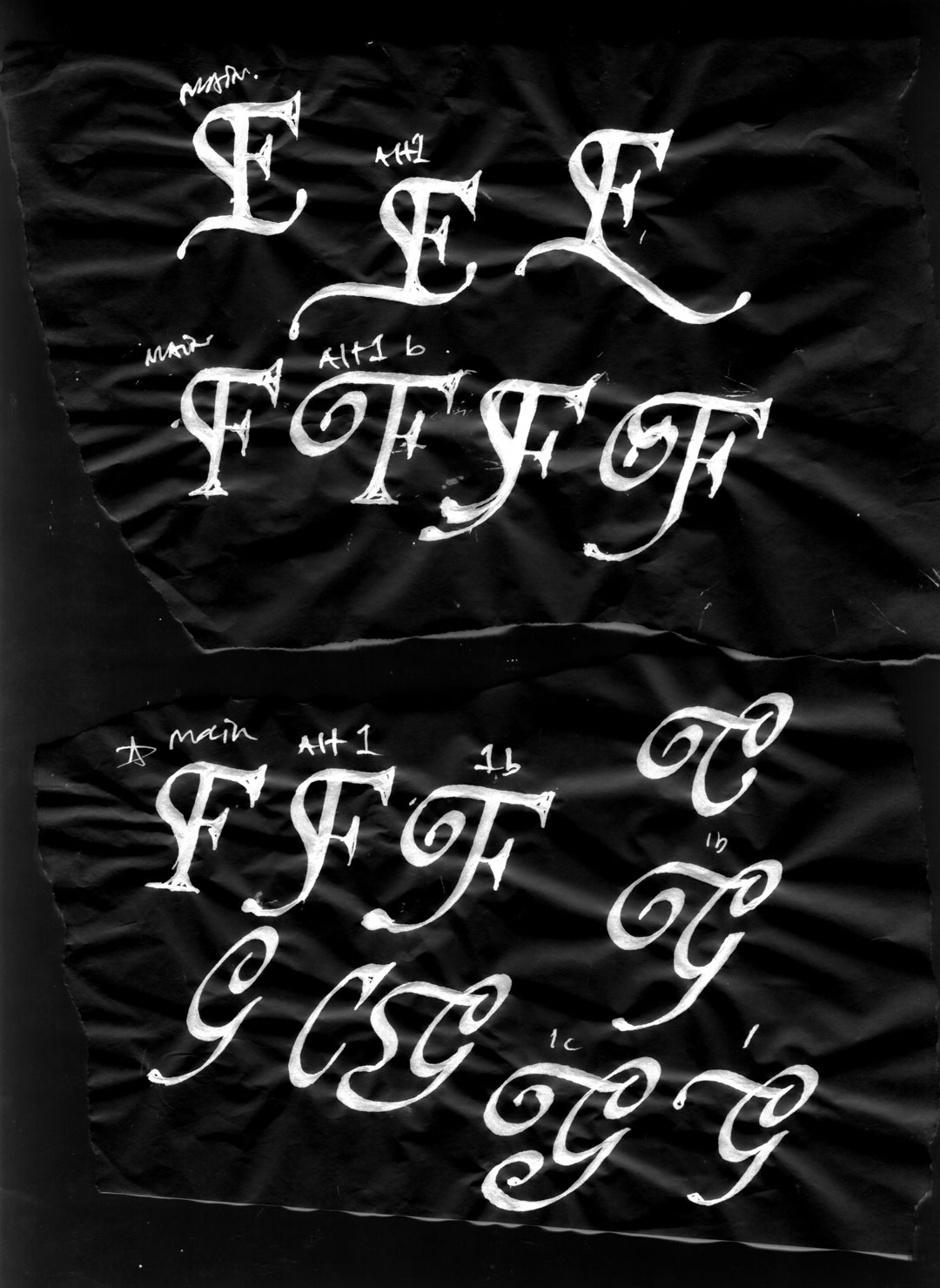
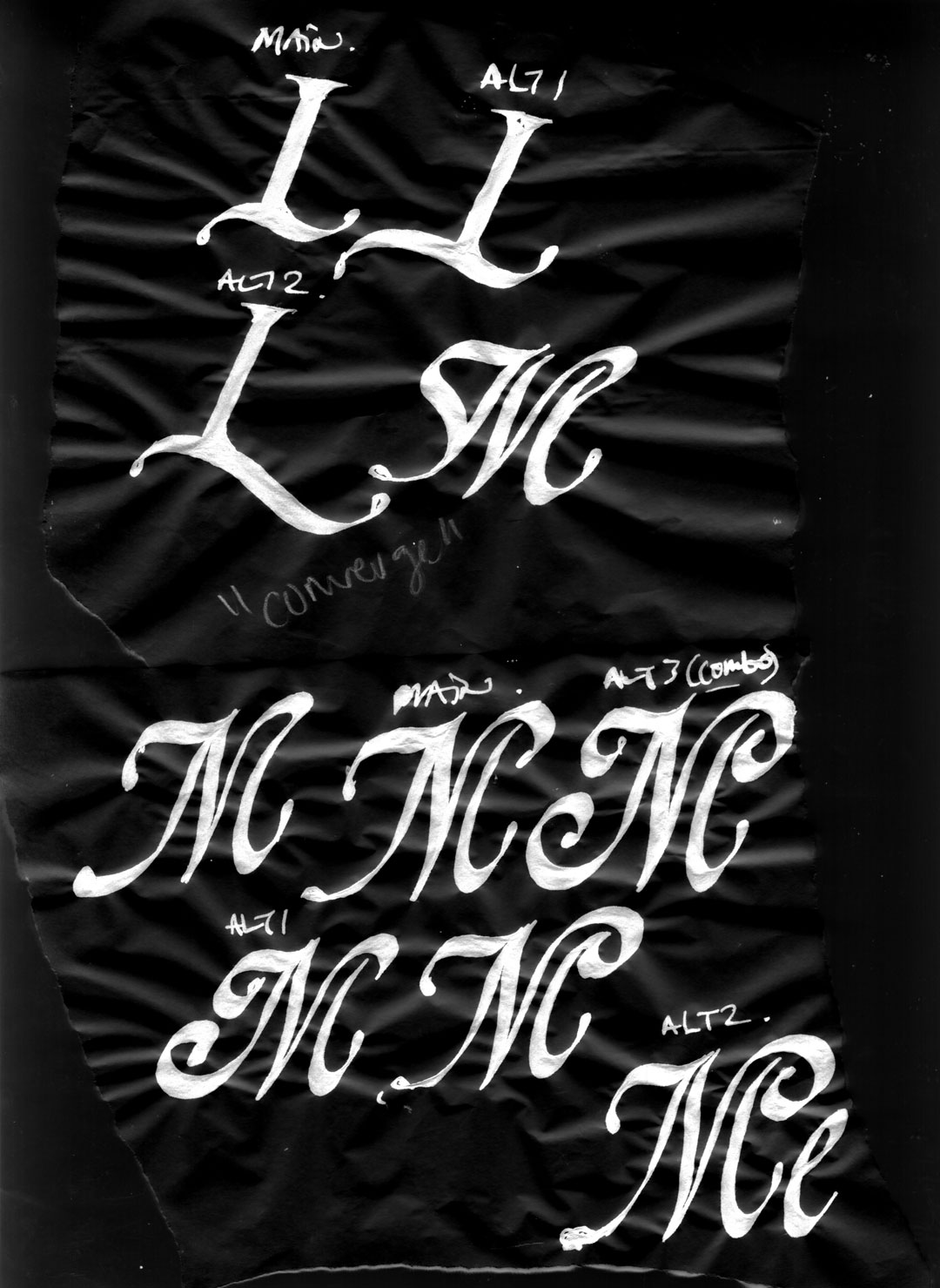
broad pen calligraphy
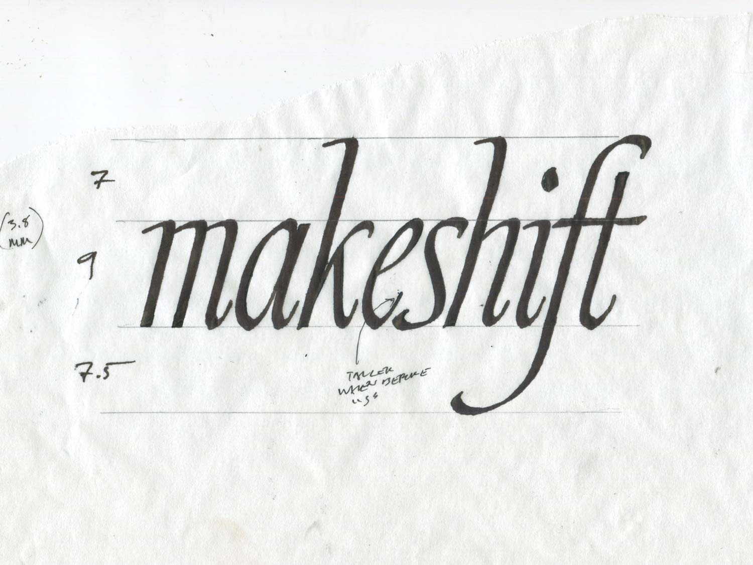
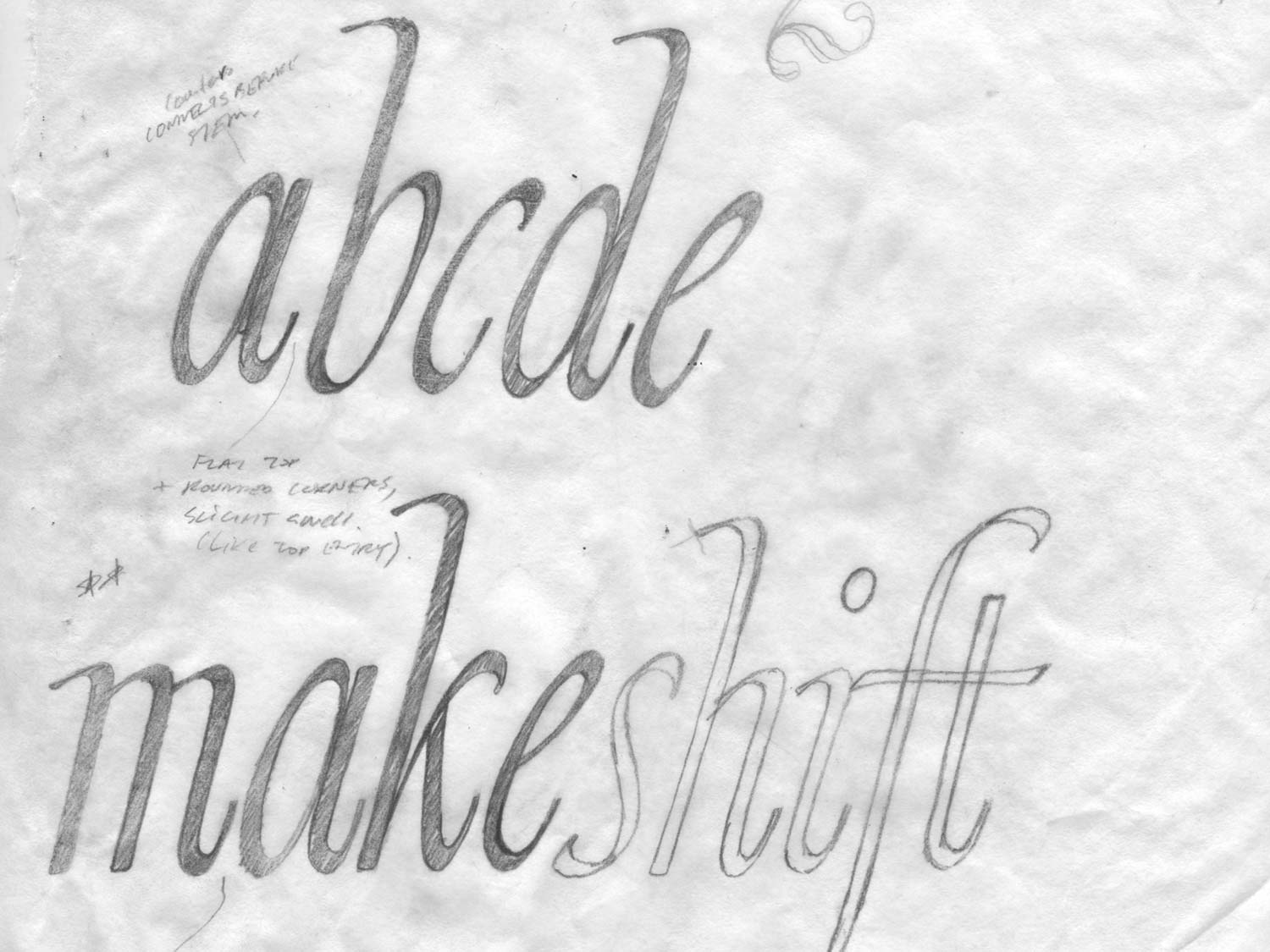
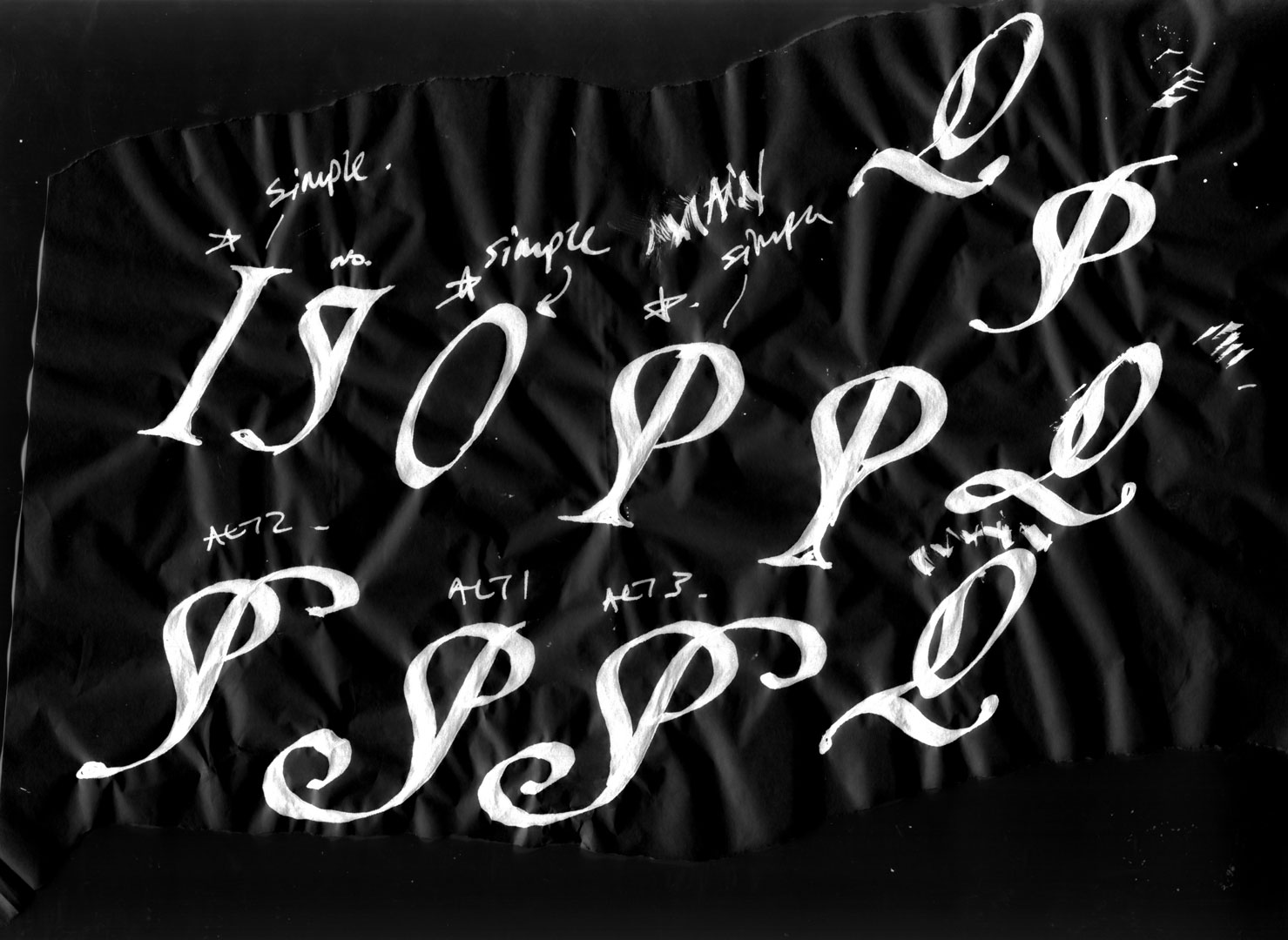
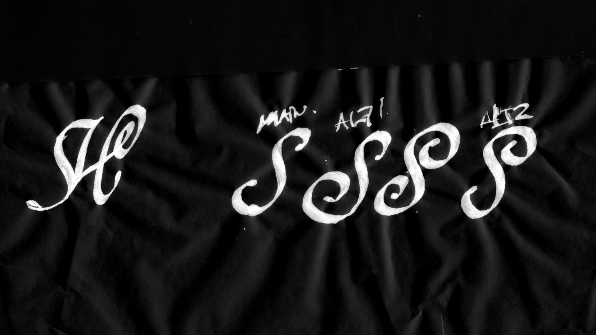
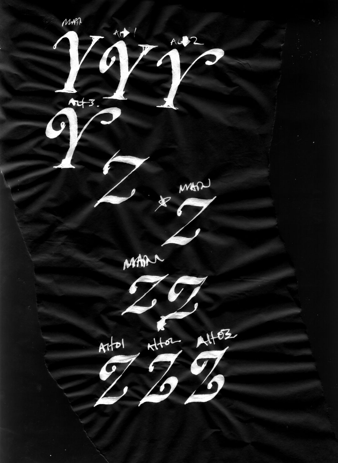
The 7, 9, and 7.5 to the left of Makeshift refers to the number of pen nibs – In the example above, I’m exploring using the stroke width of the broad pen to establish the height of the ascenders, lowercase, and descenders. Additionally, the drawing makes a note about the final stroke of the e becoming higher in instances where it appears before the s.
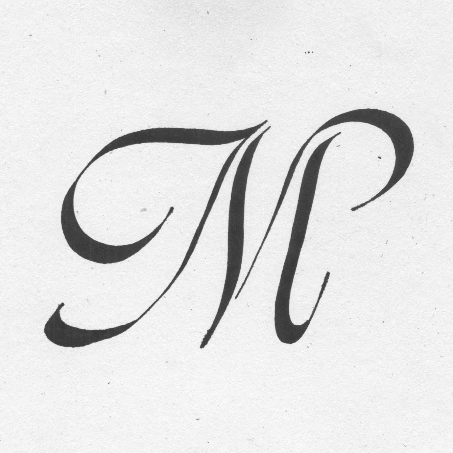
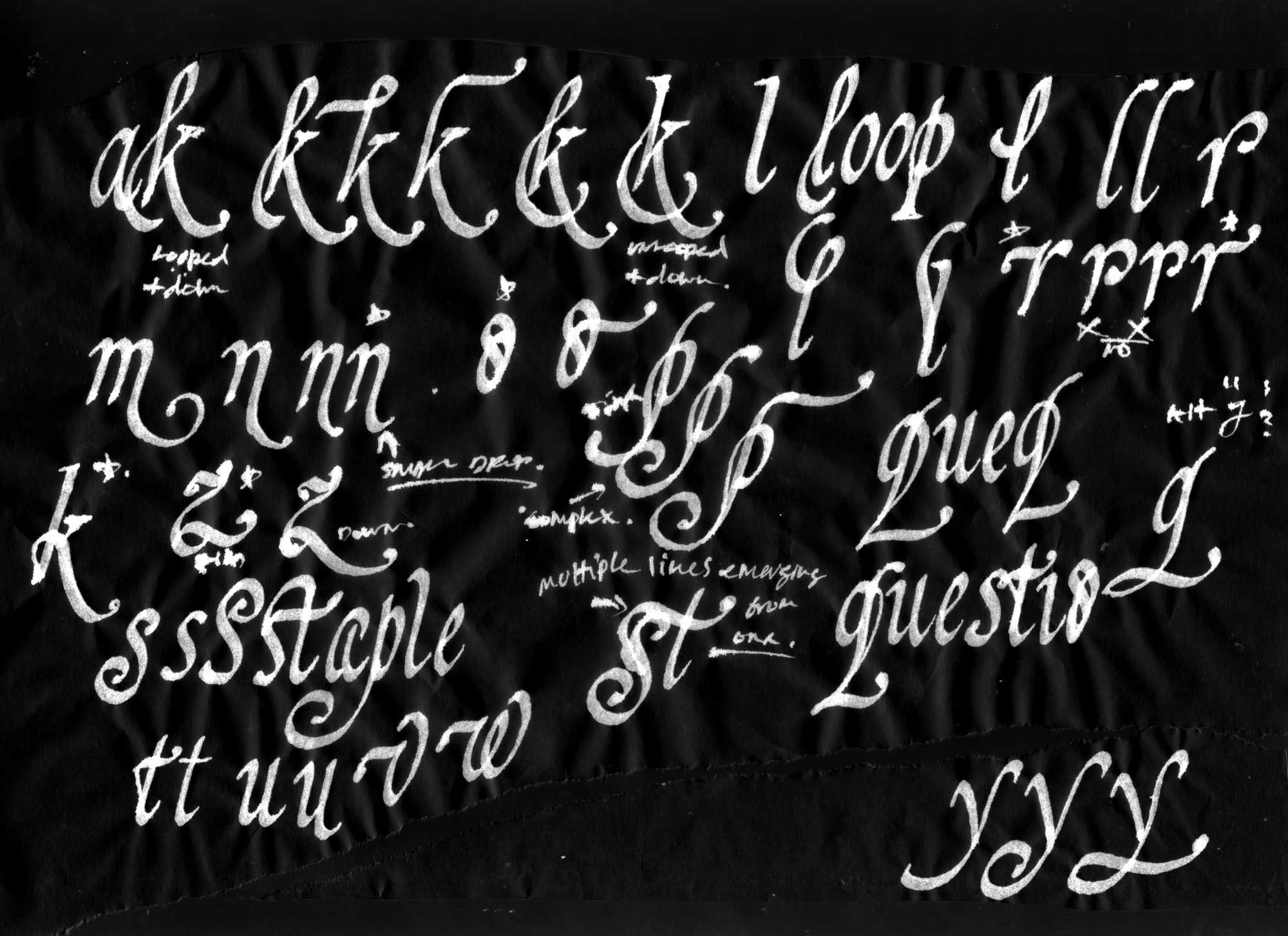
“M” written with broad pen
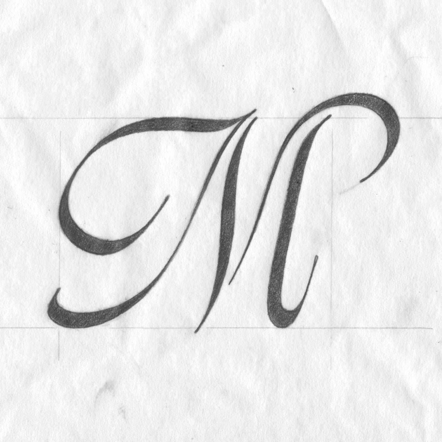
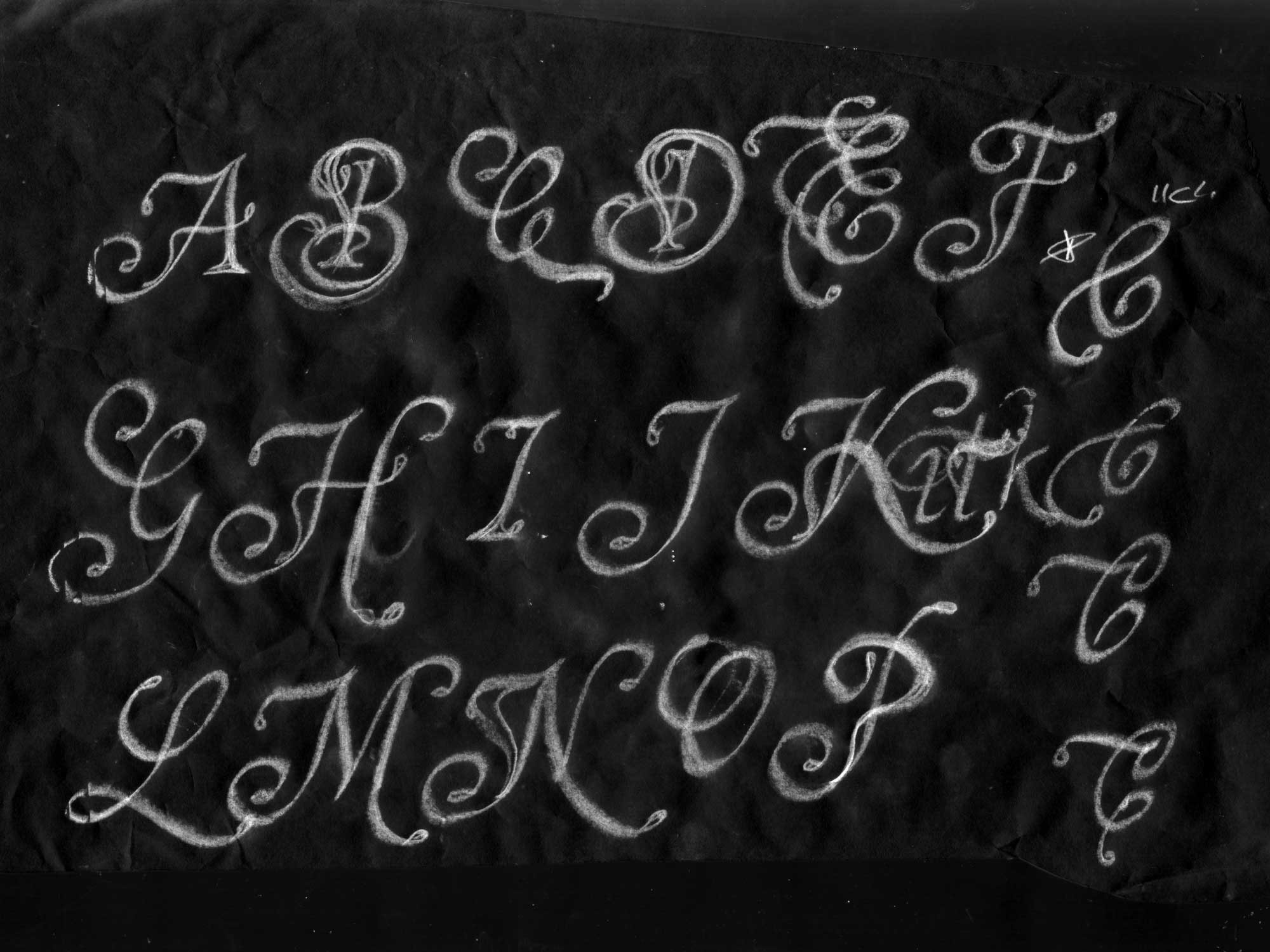
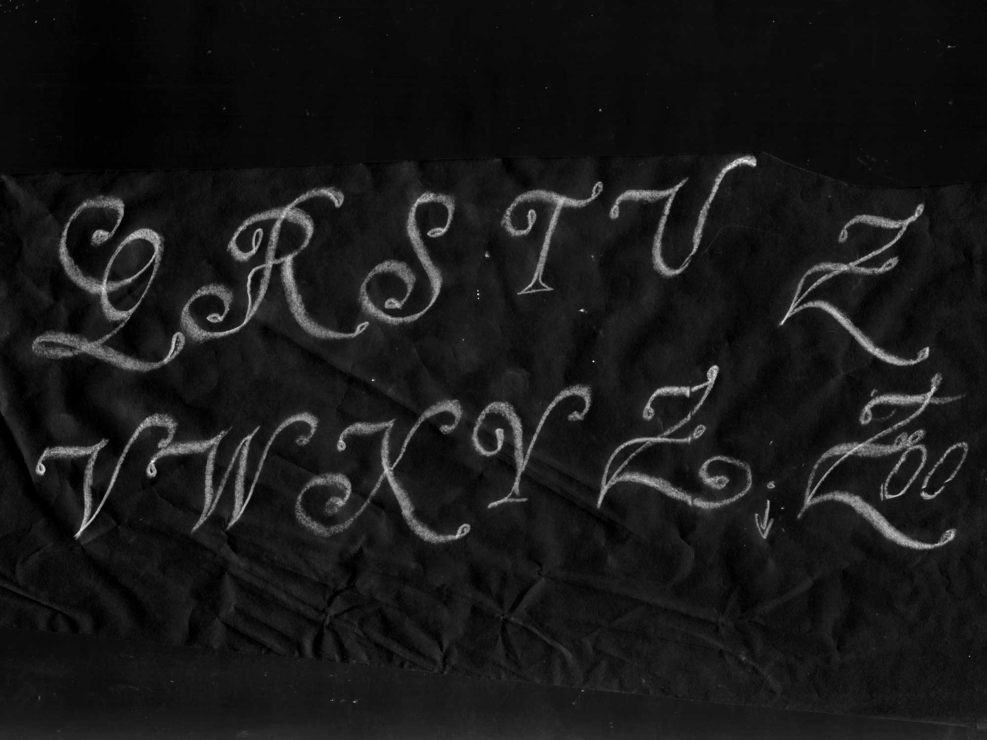
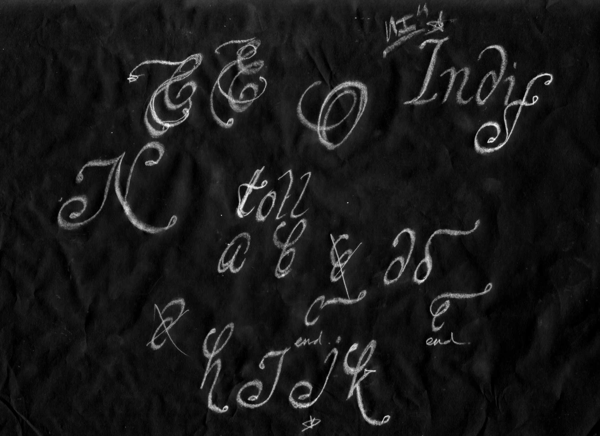
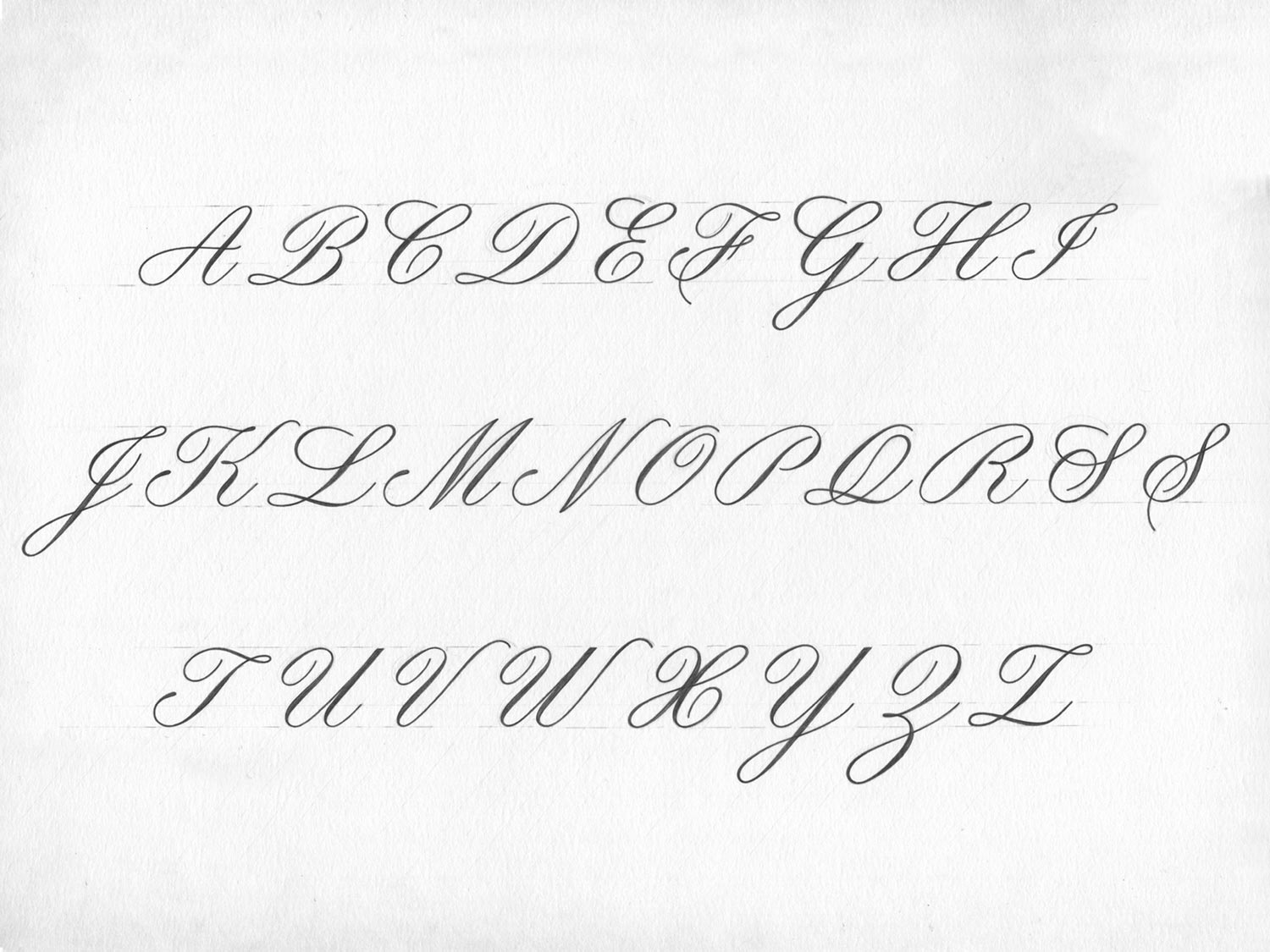
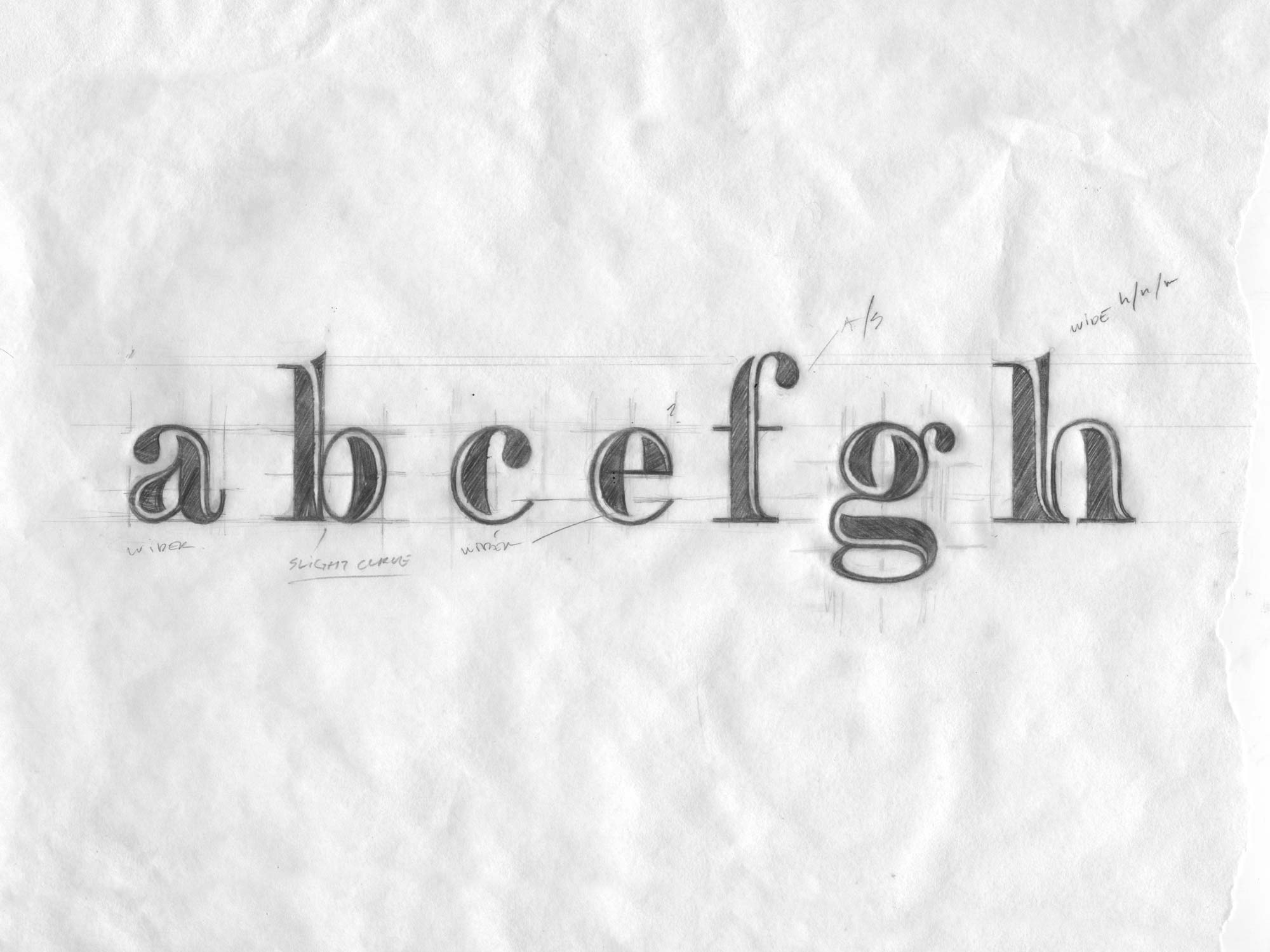
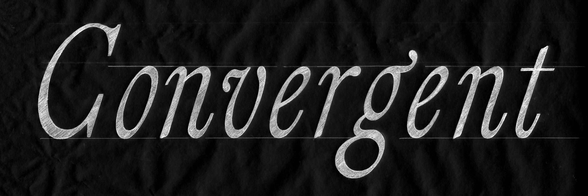
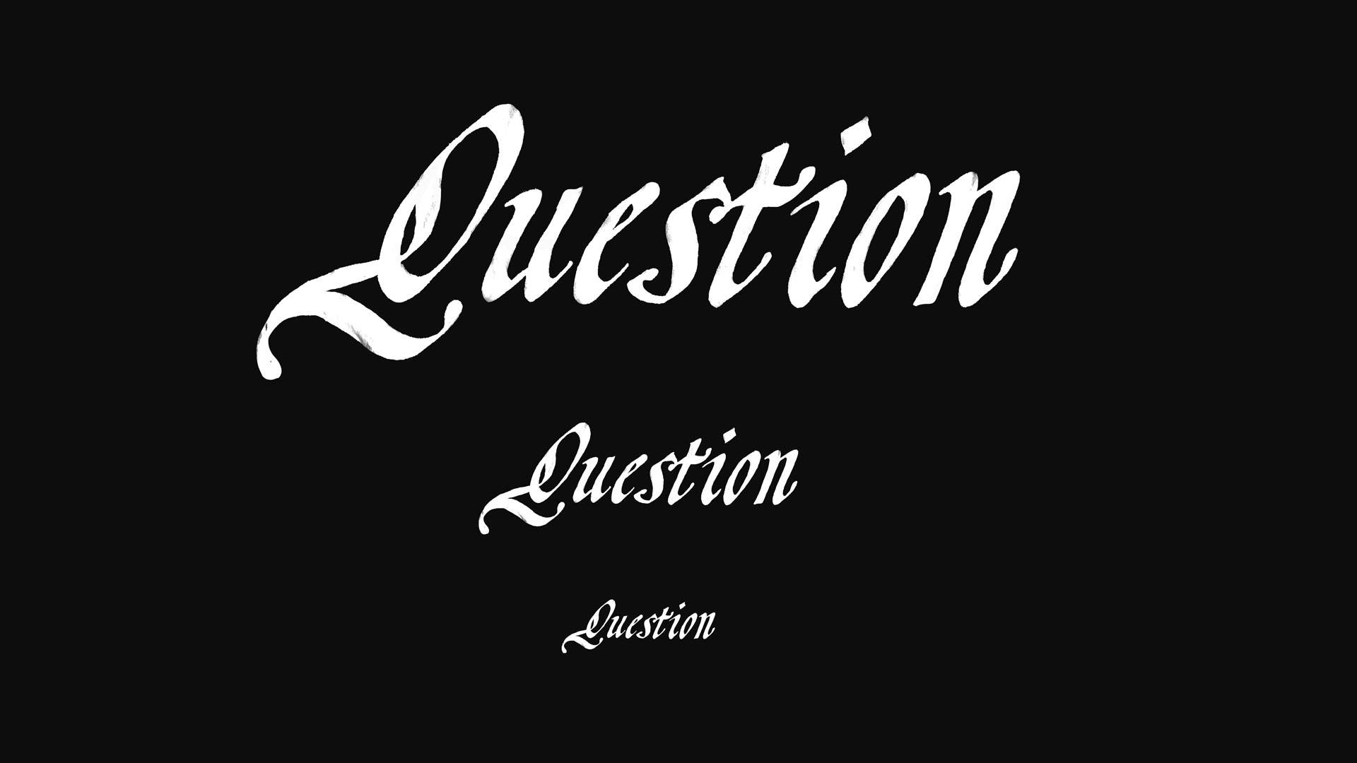
refined pencil illustration
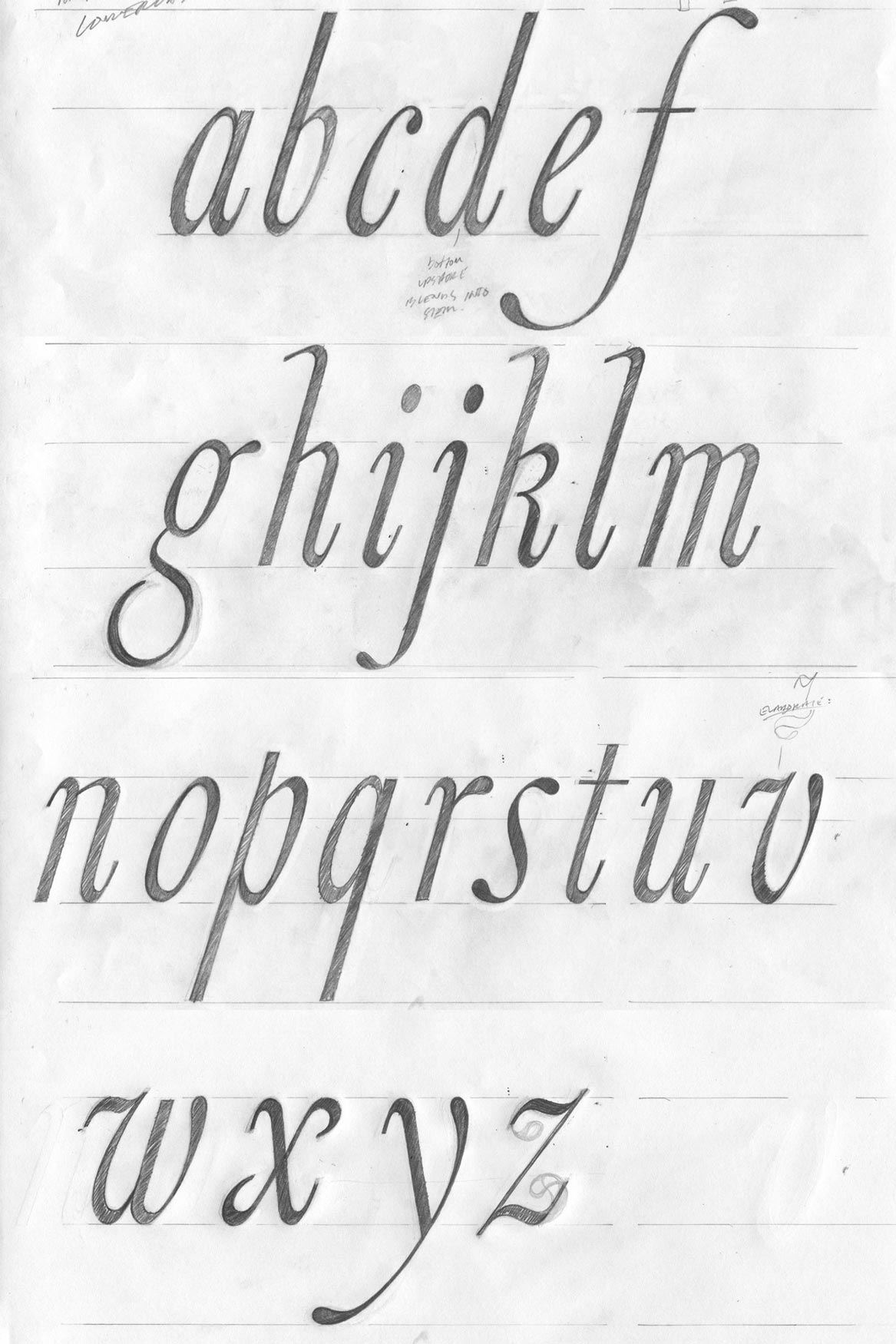
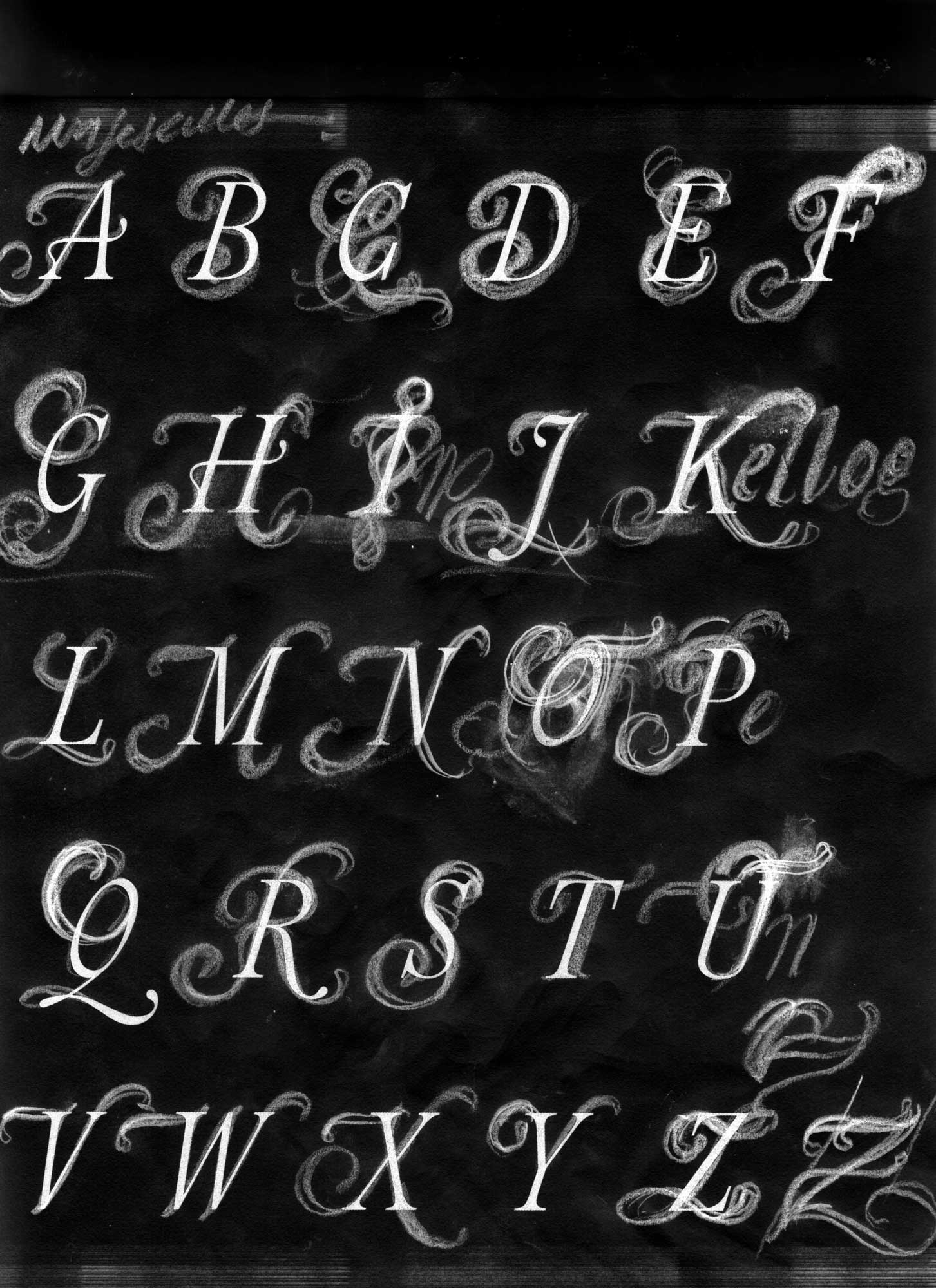
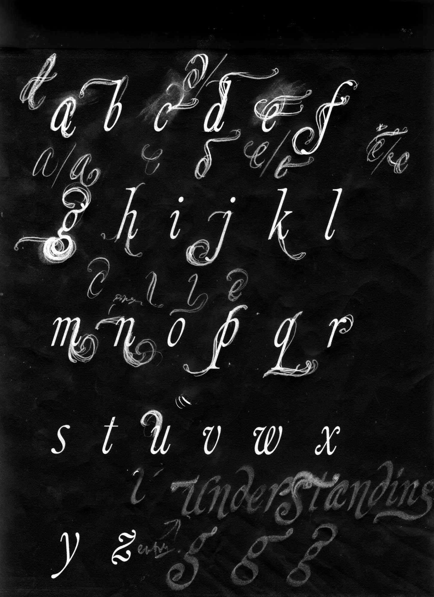
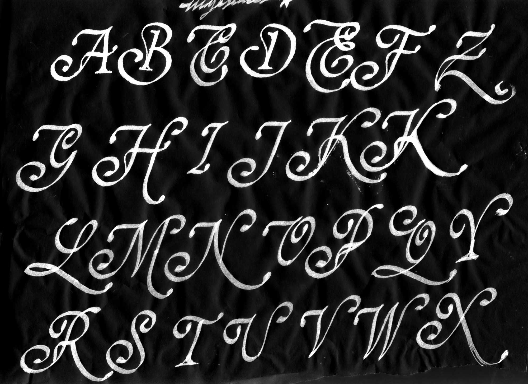
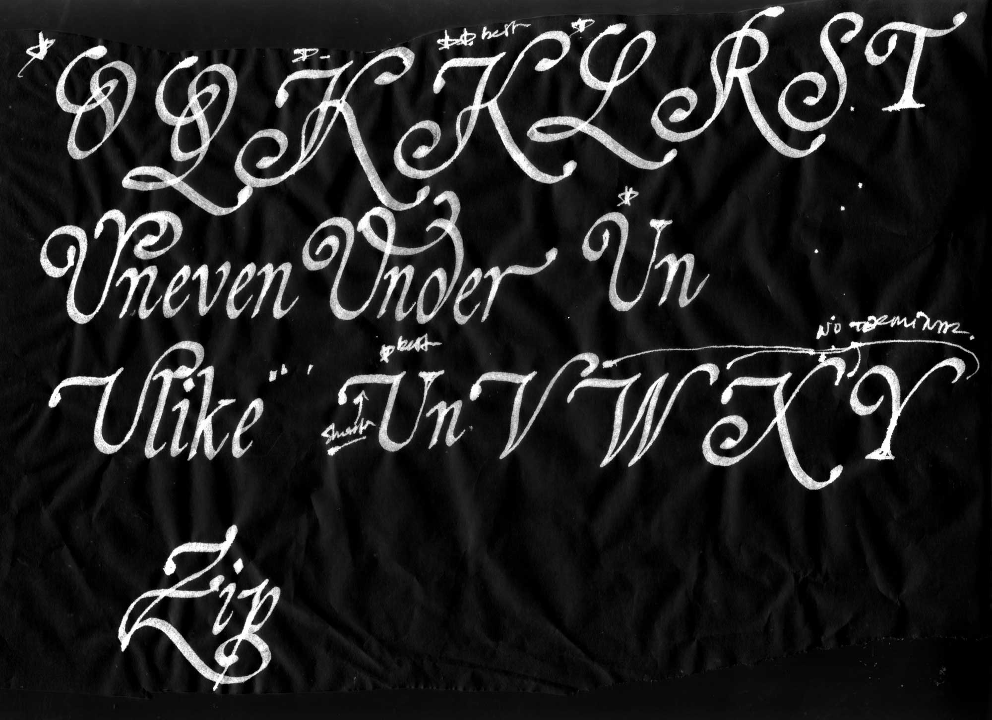
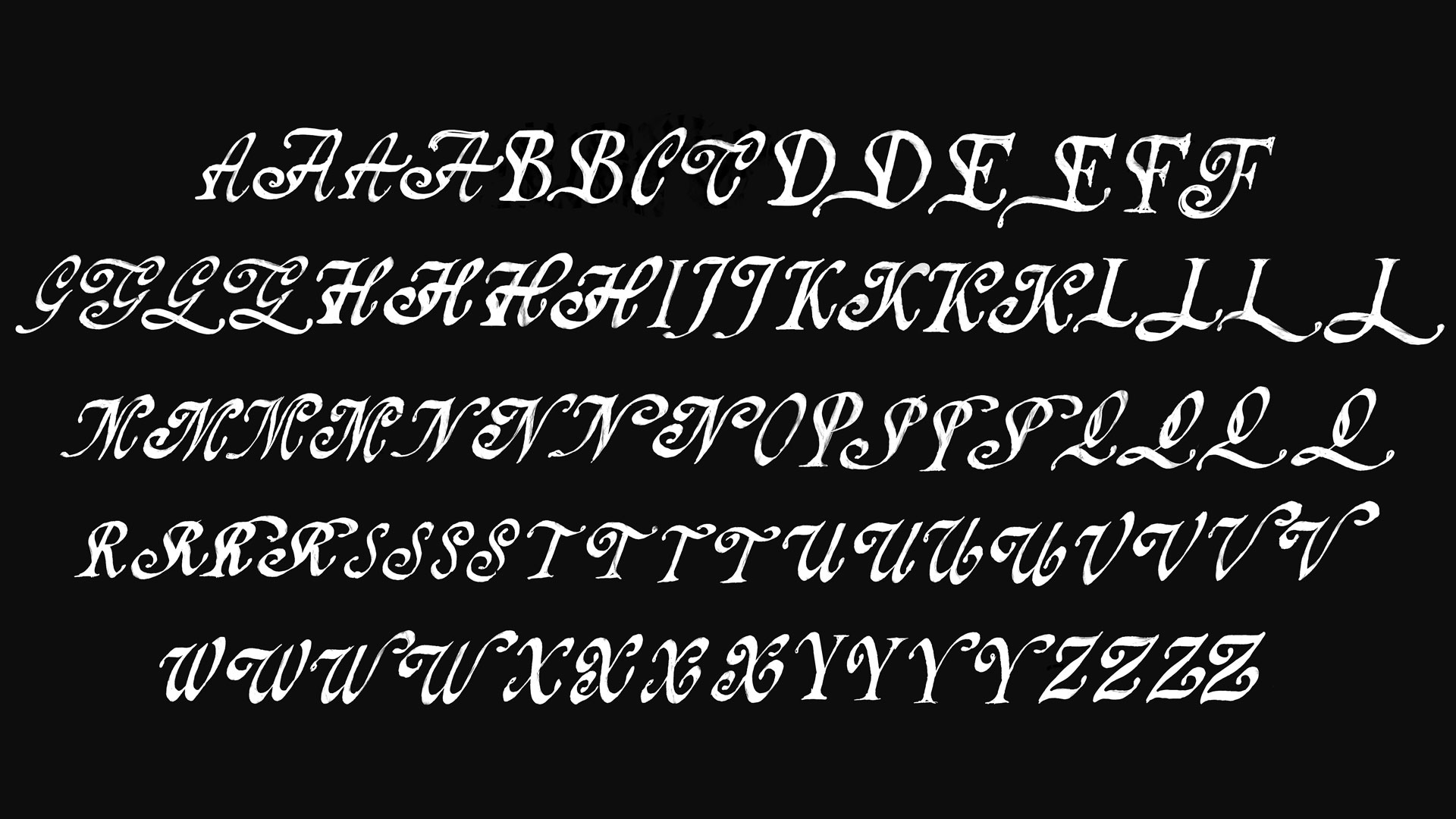
The font production process began with a set of regular-weight uppercase, lowercase, and a couple of symbols. To boost fanciness, subtle details were added to the previously flat stems. Additionally, the A, H, Q, and f were given elaborate strokes to reflect the unique lowercase p.
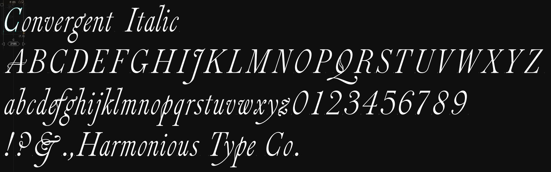
first round of vectorized forms in FontLab
Part 2. Revised Direction
……. …….
………
………